Cracking the Da Vinci code in typography
December 3, 2007
I was so lazy last weekend!!! End up just browsing through the net… But found 1 interesting article posted by one of my company long time customer KAY – FigTree Design

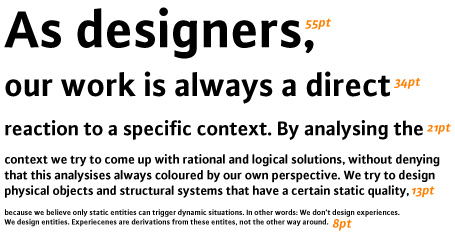
Is the above typesetting pleasant to the eyes? It better be – as it is set according to the “divine proportion”, ie: the PHI, as according to Professor Langdon.
Many years back I first read about setting type sizes as according to Fibonacci series. I didn’t really think much about that until the Dan Brown phenomena kicked in. Now that everyone is into cracking codes, it is time for me to revisit Robert Bringhurst’s insightful writings on the golden proportions.
That mysterious divine proportion of 1:1.61803. In layman english: the smaller part is roughly 38.2% and the larger part is 61.8%.
What you see above is the little experiment as typographic hierarchy expressed via type sizes chosen as according to the golden section, via a Fibonacci series:
5 . 8 . 13 . 21. 34 . 55 . 89
These type sizes whould be sufficient for most works.
Other scales could be created via the same series:
6 . 10 . 16 . 26 . 42 . 68 . 110
4. 7 . 11 . 18 . 29 . 47 . 76
Page sizes could also be determined as according to this relation. For many centuries Penguin books had been manufactured as according to 111 X 180 mm.
111 x 1.61803 = 179.6 (!)
Which also means a better height to accomodate the standard A4 width of 210mm is
210 x 1.61803 = 339.8
Original post link: http://k.figtreedesign.com/2006/05/09/cracking-the-da-vinci-code-in-typography/


